How Social Media and Mobile Technology Impact the Customer Experience [Infographic]

It’s easy for technology start-ups and web service companies to understand the importance of communicating with customers through channels such as social media and mobile technology. They have it ingrained in their DNA. It’s more difficult for companies that have a long-standing culture of face to face or direct mail interaction, to adopt these methods.

It’s not that face to face interaction with customers is unimportant. I believe that it is still the single best method for building relationships and getting a true understanding of your customers’ needs. The problem is that it takes time and your customers aren’t always willing to give it. With a myriad of choices, customers opt for the quickest and most painless way of learning, providing feedback, complimenting, or complaining.

Avaya, a global provider of business collaboration and communications solutions, has created the infographic below titled “How Social Media and Mobile Technology Impact the Customer Experience.” This great research identifies and ranks the channels that consumers prefer when interacting with brands.

Preferred Channels to Interact with Businesses (in order of most preferred to least preferred)

  • Phone Direct - 84%
  • Email - 80%
  • Company Website - 72%
  • Face to Face - 64%
  • Website FAQ - 54%
  • Post/direct Mail - 41%
  • Phone Call - 37%
  • Text/SMS - 34%
  • Company Online Forum - 30%
  • Web Chat - 29%
  • External Online Forum - 25%
  • Skype - 22%
  • Facebook/Other Social Network - 16%
  • Mobile Apps - 12%
  • Video Conferencing 11%

If you’re a business owner or brand marketer, it’s important to recognize that your customers have a preference to how they’d like to engage with you. Are you adopting the right channels?

How Social Media and Mobile Technology Impact the Customer Experience Infographic:

How Social Media and Mobile Technology Impact the Customer Experience

Infographic by: Avaya

How to Improve Google Adwords Quality Scores [Infographic]

I recently stumbled upon an useful infographic created by Digital Net Agency, a performance-based search agency with a concentration on Search Engine Optimization (SEO) and Search Engine Marketing (SEM). The infographic provides great insight into one of the most important aspects of paid search advertising, the Google Adwords Quality Score.

The Quality Score is essential for digital marketers to understand because it helps determine how much you have to pay to receive a position in the “sponsored” area of the search engine results page. You can optimize your Quality Score to receive a higher position for a lower bid that your competitors. Said another way, you’ll pay less money for more clicks and visibility. Therefore, it is important to understand and measure.

Quick summary of Google Adwords Quality Score factors:

  • Click-through rate (CTR)
  • Relative (CTR)
  • Landing-page quality
  • Keyword/search relevance
  • Ad/site Performance
  • Display URLs past CTR
  • Account history
  • Keyword/ad relevance
  • Geographic performance
  • Targeted devices

Focus on your “kewords, ads, and landing-page relevancy” and you can improve your Google Adwords Quality Score.

How to Improve Google Adwords Quality Scores Infographic:

Improve Google Quality Score Infographic

Source: DigitalNetAgency.com

Social Media at the 2012 Olympics

For the London 2012 Olympics, the organizers and the International Olympic Committee (IOC) has recognized that people want to receive their event news in different ways. They have therefore responded by embracing and focusing on social media, in addition to more traditional media such as print and television. This is a change from even the last Olympics four years ago as Twitter was banned in China during the Beijing 2008 Olympic Games and there was no official Facebook integration.

For the London 2012 Olympics, the IOC created a website to become the hub of all digital media. Named appropriately, the website is HUB.OLYMPIC.ORG. It automatically pulls in Olympic Twitter posts and allows you to connect with Facebook. It also shows interesting facts such as the “Top Followed Athletes”, led by LeBron James and Kobe Bryant.

Social media has been a great success so far as viewers, athletes, and countries fully engage with each other throughout the games. You have the opportunity to follow most of the popular athletes or a particular event of your interest. The primary Twitter account is @London2012 but you can also follow every event.

Each event has it’s own Twitter account:
@L2012Archery, @L2012Athletics, @L2012Badminton, @L2012Basketball, @L2012BeachVball, @L2012Boxing, @L2012CanoeSLA, @L2012CanoeSPR, @L2012BMX, @L2012MTB, @L2012RdCycling, @L2012TrkCycling, @L2012Diving, @L2012Equestrian, @L2012Fencing, @L2012Football, @L2012ArtGym, @L2012RhyGym, @L2012Trampoline, @L2012Handball, @L2012Hockey, @L2012Judo, @L2012ModPent, @L2012Rowing, @L2012Sailing, @L2012Shooting, @L2012Swimming, @L2012Synchro, @L2012TT, @L2012Taekwondo, @L2012Tennis, @L2012Triathlon, @L2012Volleyball, @L2012WaterPolo, @L2012Weightlift, @L2012Wrestling

Below are some interesting infographics that also show social media rocking at the London 2012 Olympic games.

INFOGRAPHIC #1 - The Olympics: Following the world’s most prestigious sporting event, from TV to Twitter

Quick stats:

  • Over 1,000 athletes joined the Olympic Hub
  • From 2008 to 2012, Twitter increased from 6 million to 140 million users
  • From 2008 to 2012, Facebook increased from 100 million to 845 million users
  • 4.3 billion viewers tuned into the 2008 Olympic games

INFOGRAPHIC #2 - Socialympics and the Twitter Games

This infographic by ExactTarget, a global Software as a Service leader was shared in a blog post titled “Facts and Figures Behind Social Media and the Olympics #Infographic“.

Quick stats:

  • Equestrian, Swimming, and Volleyball have the most followers leading up to the games.
  • LeBron James and Kobe Bryant are the most popular athletes, measured on Twitter and Facebook.
  • Not all athletes are embracing social media when you compare followers to medals won.
  • Twitter was banned in China in 2008, so it played a little role. That has changed with London hosting the games and embracing it by creating an account for every event.

Social Media and the 2012 Olympics

This infographic is brought to you by ExactTarget, a leader in social media marketing.

Bonus Infographics:

INFOGRAPHIC #3 - Which Olympic Event is Winning on Social Media?

Mashable also released a pretty cool infographic in their post titled Which Olympic Event is Winning on Social Media? [INFOGRAPHIC]. Including stats revealing the top 10 Olympic sports being discussed. Here they are in order of most popular to least popular: basketball, soccer, aquatics, gymnastics, track & field, tennis, cycling, equestrian, volleyball, and field hockey.

INFOGRAPHIC #4 - Econolympics: The Economic Impact of Hosting the Olympic Games (Infographic)

Although it’s not directly related to marketing, I thought I’d share this interesting infographic by Credit Season. They’re a UK financial solutions provider Credit Season and they put together an infographic showing the rising cost and economic growth resulting from hosting the games. They dub the infographic “ECONOLYMPICS”.

Content Marketing Strategy, Post Google Algorithm Changes [Infographic]

If your website rankings have changed for the worse as a result of Google’s Panda and Penguin algorithm updates, you’re probably looking for a new SEO tactics. The founders of Quaturo, a content marketing company, and Neo Mammalian  Studios, a infographic design company, put together this infographic titled “Content Marketing: What’s your plan of attack?

The infographic cleverly relates content marketing to warfare, focusing on different strategies and tactics pre/post Panda and Penguin. Before these major Google algorithm updates, a website could get high rankings by applying the  “weapons” blog spamming, blog networks, linkwheel, mass paid linking, article, marketing, and web 2.0. These tactics allowed for scalable and noticeable affects on search engine rankings. The alternative “weapons”, as presented in the infographic, are quality blogging, unique guest posts, interactive content, infographics, linkbaiting, and asset building. The latter is considerably more time consuming but obviously of more value to the end-user.

What has been the results of the Google Panda and Penguin updates?

  • 12% of search results were affected by Panda, as it focused on “spam factors”, “keyword stuffing”, and “over-optimization.”
  • 3.1% of search results were affected by Penguin, as it focused on quality over quantity.

How should you react to these changes?

If you’ve subscribed to the quality over quantity mindset on your website and have been doing what’s best for the user first, you’ve probably noticed minimal changes in your rankings. You’re the SEO marketer who has been doing things right from day 1. The truth is Google, Bing, and whatever other search engines pops up are going to continuously tweak their algorithms to “better” their results.

If you’re applying gray hat or black hat tactics that “chase the algorithm” then you’re at risk of changes such as these destroying your rankings. Does your website really deserve to be number one? Are you the biggest? Do your customers naturally generate the most buzz for your company over your competitors? If the answers to any of these questions are “no” then you’ve likely resorted to tweaking your site up the results page. Step back, focus on creating some real value and stop building thousands of irrelevant links. Focus on adding value to your customer and you won’t have to worry about these changes or any future ones.

View this great content marketing infographic below:

Infographic by Quaturo

Success Tip: Don’t Multitask [Infographic]

If you’re looking to be more productive then it’s helpful to understand exactly how multitasking affects your brain. According to a recent infographic by OnlineUniversities.com, your brain “wasn’t designed to handle the amount information it is currently processing.”

In an age where 695,000 Facebook status updates, 1,500 blog posts, and 168 million emails are sent every 60 seconds, it remains difficult to focus and keep from multitasking. It pays however to limit your tasks to a maximum two at a time. According to the infographic:

When the brain is faced with two tasks, the medial prefrontal cortex divides into so that each half can focus on one task. The anterior-most part of the frontal lobes enables the switch between two goals. When a third task comes into play, it’s too much for the brain to handle at once. Consequently, accuracy drops considerable.

Some more interesting stats from the infographic:

  • 50% of Firefox Users have 2.38 tabs open on average.
  • 25% of Firefox Users have 3.59 tabs open on average.
  • People with email opened switched tabs 37 times over those without email, who opened at 18 times.
  • The average computer user checks 40 websites a day.
  • The average computer user switches programs 36 times an hour, or every two minutes!
  • Media consumed in the year 1960 per person was 5 hours. That number has jumped to 12 hours per day.

Here are some tips from the infographic that can help you combat stress and digital information overload:

  • Set only a few times per day to check email. Send messages in batches
  • Schedule time to check your social networking sites.
  • Subscribe to RSS feeds so you can read your blogs all at once and in one place.
  • Turn off the tech when with  family and friends.
  • Take a break from technology after hours.

Measure your time on a task to minimize your multitasking and reduce your stress:

This “Digital Stress and Your Brain” infographic, combined with the more scary side-effect of sitting down all day, caused me to think deeply about breaks. I’m often so involved in what I want to accomplish that day that I spend too much time hammering through tasks without getting up. I know I need to stand up, drink water, and recharge but often forget.

A small Jquery tool I created that anyone is free to try, take, or modify is a countdown timer in the browser. The timer counts down from 30 minutes and then pops up an alert window saying “times up!” The idea is to stand up, drink some water, and take a short break. You can modify the time to anything you want by changing the query string.

Example: http://codyward.com/countdown/?time=14:52

Click the image below to open the countdown timer.

View the infographic below:

Via: OnlineUniversities.com

How People Spend Their Time Online [Infographic]

Originally posted by Go-Golf.com, a Dubai Web Design and Web Application Development Company. The entire post was valuable so it has been shared in full below. Thanks Go-Golf.com!

Did you Know

Global Online Population of 2,095,006,005 equals 30% of World’s Population.

Global Time Spent Online Per Month is 35,000,000,000 hours (35 Billion) which is equivalent to 3,995,444 years

US Internet user on average spends 32 hours on internet per month. This is double than the time spent by Global Internet user i.e. 16 hours per month.

Asia has the highest online population of 922,329,554 online users whereas North America has the highest online penetration rate of 78.90%

China has the highest number of Internet users 456,238,464 i.e 34.30% of its total population

Social networking is the most time consuming activity for an Internet user. A normal Internet user spends around 22% of its time on social networking sites, 21% on searches, 20% on reading content, 19% on emails and communication, 13% on multimedia sites and 5% on online shopping

92% of Internet users have used Internet for sending e-mails and for using search engines. 83% for getting more information related to health or hobbies. 82% for searching directions. 81% for getting weather information.78% for information on new products. 76% for reading news. 72% for entertainment and 71% for online shopping.

Google is the most visited web property online. Whereas, Facebook is the biggest time. A normal Facebook users spends around 7 hours, 45 minutes and 49 seconds per month on Facebook.

Some more Interesting Facts

More than 56% of Social Networking Users have used Social Networking Sites for spying on their partners.

Brazilians have the highest online friends averaging 481 friends per user, whereas Japanese have the least average of only 29 friends.

Chinese users spend the maximum time of more than 5 hours a week,in shopping online.

More than 1 Billion Search Queries per day on Google.

4 Billion views per day on Video Sharing Website YouTube. (Social Networking site)

Video content of more than 60 hours gets uploaded every minute onto YouTube.

More than 250 Million Tweets per day.

More than 800 Million updates on Facebook per day.

Location best services and Time Shifted TV will be the most popular trends of future with growth rate of 27% followed by Internet Banking growing at 19% per year.

How People Spend Their Time Online
Infographic by- GO-Gulf.com Dubai Web Design Company

How Marketers Use Social Media [Infographic]

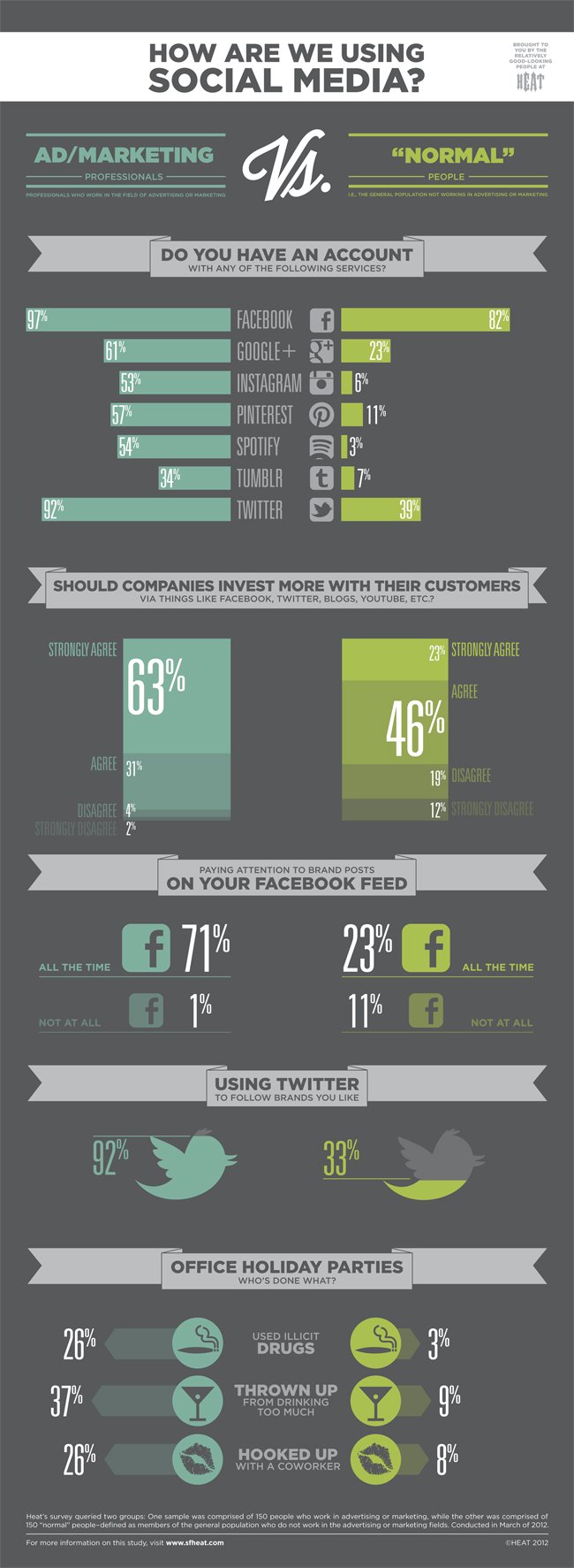
It’s no surprise that advertising professionals are advocates of social media. We research, test, and execute marketing campaigns on a daily basis and they design these campaigns with the purpose of delivering a message to a targeted group of prospects. Social media not only allows for highly targeted messaging but it’s extremely scalable. The message can be sent and re-sent by the recipients. This inherently viral component, along with the ability to measure it, makes it very appealing for use.

But are “Normal” or non-advertising professionals using it the same way? Are they as engaged on Twitter, Facebook, or Pinterest? Do they log the same amount of hours as the marketing managers?

This infographic by SF Heat provides some interesting insight into the difference.

Some interesting highlights:

  • 92% of Ad Pros follow brands they like versus 33% of normal people.
  • 61% of Ad Pros have a Google+ account versus 23% of normal people.
  • 63% of Ad Pros “Strongly Agree” that companies should invest in social media with their customers versus 23% of normal people.

View the full infographic below, click to enlarge: